Good UX/UI tends to disappear into the background. It works, it flows, and nobody complains about it. But great UX/UI is felt. It delights and converts, and it’s the reason people come back. In a market where customers are spoiled for choice and increasingly design-literate, “good enough” has become the bare minimum, and it may be quietly killing your growth.
According to Forrester Research, a well-designed interface can lift conversion rates by up to 200%, while a genuinely great user experience can push that figure as high as 400%.
Good UX/UI is no longer a differentiator
Let’s start with the uncomfortable truth: good UX/UI design is table stakes now. Your customers have been shaped by Airbnb, Spotify, Apple, and a hundred other brands who have spent billions making digital experiences feel effortless. They rarely notice good design consciously, but they feel the friction of bad design almost immediately, and it’s often enough to make the whole thing feel untrustworthy immediately.
Competition is fiercer, attention spans are shorter, and people, whether they realise it or not, have developed an instinctive literacy for design. They know and expect what good feels like, so what they’re looking for now is what great feels like.
Before we get into how you get there, though, here’s a quick overview of the difference.
What is UX and UI design, and what’s the difference?
UX and UI get used interchangeably far too often, so before we go any further, let’s get precise about what each term actually means.
UX (User Experience) design is the architecture of how someone moves through your product, website, or service. Think of it as the underlying logic of the flow, the decisions, the journey from ‘I’m here’ to ‘I did the thing.’ It determines whether using your product feels natural or like assembling flat-pack furniture without the instructions.
UI (User Interface) design is what your users see and interact with. The visual layer of buttons, typography, colour, spacing, and hierarchy that gives the experience its aesthetic and its visual language. It’s the craft that shapes first impressions and communicates personality before a single word is read.
The key distinction: UX is the function and UI is the form.
Think of it like a building. The floor plan, where rooms sit, how traffic flows, which doors connect to what, is your UX. The interior design, the lighting, the materials, the feeling you get when you walk in, is your UI. A stunning interior in a badly planned space still frustrates everyone who uses it, just as a brilliant floor plan in a space that feels cold and uninviting still drives people out the door.
What makes good UX/UI?
Good UX/UI design does what it says on the tin: it meets the standard and keeps users from getting confused, frustrated, or lost.
Here’s what “good” looks like in practice:
- Wayfinding: Users know where they are, what to do next, and how to get back.
- Consistency: Visual and interaction patterns are predictable across the experience.
- Accessibility: The design works for people of varying abilities, screen sizes, and contexts.
- Performance: Pages load, things work, and nobody waits.
- Mobile responsiveness: Hubspot research links mobile-friendly pages to significantly higher engagement.
These are the entry fees rather than extras. And if your design doesn’t meet all of them, you’re not even at “good” yet.
What Makes Great UX/UI Design?

Great UX/UI design goes beyond function to resonate, leaving users feeling capable, understood, and sometimes even delighted, well beyond simply completing a task.
The shift from good to great comes down to a few critical layers:
1. Emotional Connection
Great design makes users feel something, whether that’s confidence in your brand, warmth and excitement, or a clear sense of what to do next, and that feeling is deliberate rather than incidental.
Spotify understood this when they built Wrapped, an annual data summary that, by all accounts, should be unremarkable. Instead, it became a cultural moment people share voluntarily. The data stayed exactly the same; the emotional framing is what moved. When your customer feels good using your product, they associate that feeling with your brand, and that’s loyalty, built consistently, interaction by interaction.
2. Anticipatory Design
Great UX/UI solves problems before they’re even problems, predicting where users might hesitate, and removes the moment before it happens. Amazon’s “frequently bought together” doesn’t wait for you to remember what you forgot, just as Google autofills before you’ve finished your thought.
The best digital experiences are built on a deep understanding of user behaviour, rather than assumptions about it, which is why they tend to serve the next logical need without being asked.
3. Brand Integration
Good design looks fine. Great design looks unmistakably like you. When your brand identity is woven into the UX instead of being slapped on top of it, the experience reinforces trust at every touchpoint. Users don’t just recognise your logo, they recognise how it feels to use your product.
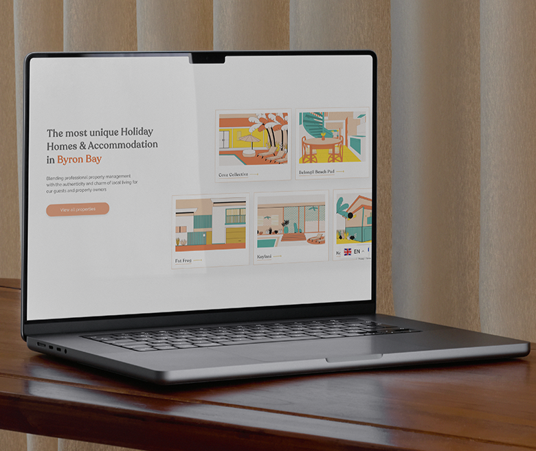
Take Beach Houses of Byron: you couldn’t mistake it for anyone else with personalised property illustrations, joyful aesthetic, and the visual choices they make every element unmistakably theirs. And because the brand ran all the way through the experience rather than sitting on top of it, the UX could do its job properly, with intuitive navigation, structured to earn trust, optimised to convert.
The result: 65% of bookings now come directly through the platform, bypassing third-party booking sites entirely, which shows distinctiveness is as much a commercial win as it is a brand one.
4. Purposeful Delight
This is the one people underestimate. Take Slack, for example. At its core, it’s a messaging tool, but the loading messages that rotate every time you open it, the emoji reactions, the subtle wit threaded through error pages and notifications make this work tool not feel like one. Great design has opinions and makes choices, and occasionally, it makes you smile in the middle of a Monday morning without quite knowing why.
5. Conversion-Conscious Architecture
Great UX/UI is built with commercial intent, guiding users toward decisions that matter to the business without ever feeling manipulative, because none of this happens in a vacuum.
Airbnb built an entire booking experience around reducing the psychological friction of trusting a stranger’s home, with photography standards, review architecture, transparent pricing, and host profiles to make the information a guest needs accessible. Every design decision is working to move you toward a booking without ever feeling like it’s pushing you, which is exactly why the best-converting experiences don’t feel like they’re converting you at all.
Where should you start? Ask these questions first
Moving from good to great isn’t a single design sprint so much as a series of deliberate decisions made from the users’ point of view. Start by sitting with these questions:
- Where are users dropping off and why? Analytics will tell you where. Behaviour mapping and user research will tell you why.
- Does your design reflect your brand, or just your product? If a competitor could paste their logo on your interface and it would still make sense, you have a brand problem, not just a design problem.
- Are you designing for the journey, or just the page? Each screen should connect to the next with intention.
- Are you solving for today’s user, or tomorrow’s? Your audience is evolving. Great design builds flexibility in from the start.
- What would your user say if they couldn’t use words? The emotional response to your interface, be it frustration, relief, delight, or even confusion, is the most honest feedback you’ll ever get.
Turning those answers into action
Auditing is only useful if you act on what you find, so here’s how to address what surfaces once you’ve done the work.
1. Find Where People Are Leaving, Then Understand Why
Analytics will tell you where users drop off. Heatmaps, session recordings, and user interviews will tell you why. Start there.
You’re looking for hesitation, confusion, and abandonment: the three signals that something in your experience isn’t doing its job. Fix the highest-traffic, highest-drop-off points first because that’s where the commercial impact lives.
2. Untangle Your Brand From Your Template
If a competitor could paste their logo onto your interface and it would still make sense, you have a brand problem disguised as a design problem.
Monzo is a good example: hot-coral cards and a conversational, typo-friendly app voice turned a banking app into something people talk about unprompted. They’ve turned brand and product into the same decision rather than two separate ones.
3. Fix the Journey, Not Just the Page
Most UX problems show up as symptoms of a broken flow rather than issues isolated to a single screen, so map how users genuinely move through your product and look for the moments where the logic breaks down.
When we worked with Screen Careers, the challenge wasn’t any one touchpoint in isolation. Their audience was moving between in-person events, digital courses, and training programs, and the experience fractured every time they crossed from one to another. We rebuilt the digital ecosystem around the actual user journey, unifying those touchpoints into a single coherent experience. The friction disappeared once we rebuilt the flow itself, since redesigning a single page would never have addressed it.
4. Streamline Ruthlessly
Complexity is usually a sign that internal processes have leaked into the user experience. Every unnecessary step, form field, or decision you ask a user to make is an opportunity to lose them. Stripe built its entire reputation on making payment integration – historically one of the most painful developer experiences – feel almost effortless, so audit every interaction and ask whether this step serves the user or simply serves you.
5. Build in Feedback Loops
Build mechanisms to keep learning, including user testing, NPS surveys, and behaviour tracking, and treat them as ongoing inputs, instead of one-off exercises. Netflix doesn’t guess what the next iteration of their interface should look like: they test everything, from thumbnail imagery to menu structure, against real user behaviour at scale. Treat iteration less as a sign you got something wrong, and more as how you get it right.
Great UX/UI is never finished in a brief. It keeps being stress-tested with real users, refined against real behaviour, and revisited as the business evolves, so build iteration into your process and not only your launch.
That said, you don’t have to wait for a redesign to get this right, great UX/UI can be built from the start.
How to Build Great UX/UI From the Start

Building great design from the start of a brand’s creation requires a different kind of discipline. You should be thinking like your customers before a single screen is designed.
Think in journeys, not pages: Users rarely come to experience your homepage for its own sake, they come to solve a problem, find something, or feel something, so design for the journey they’re on rather than the layout you’ve built.
Build for how people actually live: They’re busy, distracted, often on mobile, and they’ll give you about seven seconds to convince them to stay, so design for real behaviour rather than ideal behaviour.
Start with your hardest user: If your design works for someone unfamiliar with your category, short on time, and using a small screen, it works for everyone. Design for difficulty, and ease follows.
Let your brand do work: From the first interaction, your design should communicate who you are, what you stand for, and why you can be trusted. Treat brand alignment as a strategic decision that builds or erodes confidence at every touchpoint, well beyond a simple visual checkbox.
Shoot for delight, not just functionality: Great UX/UI gives people something to remember because it makes their day slightly easier, their decision slightly clearer, or their experience slightly more enjoyable than expected. That margin is where loyalty is built.
Good Is the Floor. Great Is the Advantage.
Good UX/UI design should feel invisible. It’s intuitive, it functions, and it doesn’t raise questions it can’t answer. In today’s always-on, hypercompetitive digital landscape, that’s simply the minimum requirement to remain credible.
Great UX/UI design is something else entirely: it’s the experience people choose to return to, recommend to others, and remember long after the session ends. It’s design built with emotional intelligence, focused on delight, brand coherence, and solving problems before they surface, turning browsers into buyers, supporters into advocates, and scattered touchpoints into a coherent, trust-building journey.
The distance between good and great isn’t as wide as most people think as it first appears, though it takes intention, strategic thinking, and the willingness to look at your product honestly from the outside in.
Ready to move from good to great? Pascal Satori partners with growth-stage businesses on the exact work in this space: UX audits, journey redesigns, and brand-led interface design that converts.